The fastest way to add a drop cap in Word is from the Insert tab — select the paragraph, click Drop Cap, and choose Dropped. The first letter enlarges instantly and runs down across the next few lines of text, giving any document the polished, editorial look you see in books and magazines.
In this guide, you’ll learn how to insert a drop cap, customise its size, font, and position, drop the letter into the margin instead of inside the paragraph, and remove it cleanly when you want plain text back.
What Is a Drop Cap in Word?
A drop cap is a typographic effect where the first letter of a paragraph is enlarged so it spans two or more lines of the surrounding text. It is one of the oldest formatting devices in publishing — used in illuminated manuscripts, novels, magazines, and modern editorial layouts — and Microsoft Word makes it available as a single click. Use a drop cap to:
- Mark the opening of a chapter, article, or section
- Give long-form documents a publication-quality feel
- Draw the reader’s eye to the start of each new section
- Break up dense walls of text in reports, eBooks, and newsletters
Watch the Video Tutorial
If you prefer to see this in action, the full video walkthrough is below, showing each method step by step.
How to Add a Drop Cap in Word: Step-by-Step
The full workflow has three stages: insert the default drop cap, customise it to fit your document, and remove it cleanly if you change your mind. Each method below covers one stage.
Method 1: How to Add a Drop Cap in Word Using the Insert Tab
This is the default approach — fastest, cleanest, and the one to use 90% of the time.
- Click anywhere inside the paragraph you want to start with a drop cap (you don’t need to select the first letter — Word handles that automatically)
- Open the Insert tab on the ribbon
- In the Text group, click Drop Cap
- Choose Dropped from the dropdown
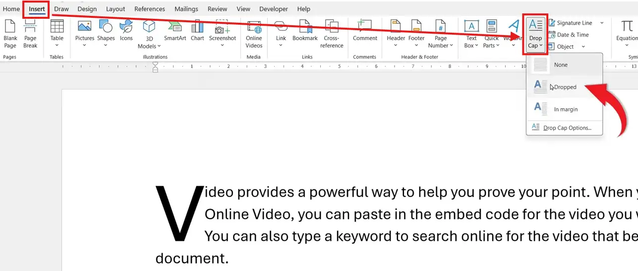
👉 The first letter of the paragraph enlarges and spans the first three lines of text by default. The rest of the paragraph automatically wraps around it.
Method 2: How to Add a Drop Cap in Word and Customise the Font, Size, and Position
The default settings work, but the Drop Cap Options dialog is where the formatting actually starts to look intentional — pick a contrasting font, control how many lines the letter spans, and tighten the spacing between the letter and the body text.
- Click inside the paragraph that already has a drop cap (or apply Method 1 first)
- Go to Insert → Drop Cap → Drop Cap Options
- In the dialog, set your preferences:
- Position — Dropped sits the letter inside the paragraph, In margin pushes it outside the body text
- Font — pick a display or serif font to contrast with your body type — and if you want the drop cap to inherit your document’s default font, the guide on how to change the default font in Microsoft Word covers the setup
- Lines to drop — 3 is the editorial standard; 2 looks tighter, 4-5 looks dramatic
- Distance from text — 0.1 cm to 0.2 cm prevents the body text from crowding the letter
- Click OK

👉 The drop cap rebuilds with your chosen settings. Increase Lines to drop to 4 or 5 for a bold opening, or switch Position to In margin for the classic editorial look where the letter sits in the white space to the left of the column.
Method 3: How to Add a Drop Cap in Word and Remove It Cleanly
If the drop cap isn’t right for the document, don’t delete the letter — that breaks the paragraph. Use the Drop Cap menu to clear the effect and restore the original text in one click.
- Click anywhere inside the paragraph that has the drop cap
- Go to Insert → Drop Cap
- Choose None

👉 The first letter returns to body text formatting and the paragraph reflows normally. No deletion, no manual reformatting required.
Which Method Should You Use?
| Method | Best For | Effort |
|---|---|---|
| Insert → Drop Cap → Dropped | The default look — quick, polished, works in 90% of documents | Low |
| Drop Cap Options dialog | Magazine-style layouts, eBooks, branded reports with a specific display font | Medium |
| Insert → Drop Cap → None | Removing a drop cap without breaking the paragraph | Low |
For everyday documents, Method 1 is enough. Reach for Method 2 when the drop cap needs to match a brand font, sit in the margin, or run more than three lines deep.
Common Problems When Adding a Drop Cap in Word
The Drop Cap option is greyed out
The cursor is inside a text box, table cell, or header/footer — Word only applies drop caps to body paragraphs. Click into the main document body, place your cursor inside a normal paragraph, then try again.
The drop cap letter overlaps the text
The Distance from text value is set to 0 cm. Open Insert → Drop Cap → Drop Cap Options and bump it to 0.1 cm or 0.2 cm. The letter and body text will separate cleanly.
The drop cap disappears when the paragraph wraps to a new page
Word doesn’t preserve drop caps that cross page breaks. Either move the paragraph so it starts on a fresh page, or use Page Setup → Paragraph → Keep with next to prevent the opening lines splitting across pages.
The drop cap is the wrong letter
Word always converts the first character of the paragraph — so if the paragraph starts with a quotation mark, dash, or space, that’s what becomes the drop cap. Delete any leading punctuation or whitespace so the first letter is the actual word you want enlarged.
Pro Tips for Using Drop Caps Effectively
- Use drop caps sparingly — one per chapter or section opener, never every paragraph, or the effect loses all impact
- Pair a serif drop cap with sans-serif body text (or vice versa) for visible contrast — a same-font drop cap looks like a sizing error
- Keep the drop cap at 3 lines for body copy and 4-5 lines only for large display layouts like magazine spreads
- Make sure the surrounding paragraph is at least 6-8 lines long — short paragraphs with a 3-line drop cap leave awkward empty space — and if your overall paragraph alignment looks off after applying one, the guide on how to align text in Microsoft Word covers the fix
FAQs
How do I add a drop cap in Word?
Click inside the paragraph, go to Insert → Drop Cap → Dropped. The first letter enlarges and spans the next three lines automatically — no selection or manual formatting needed.
What is the difference between “Dropped” and “In margin”?
Dropped sits the enlarged letter inside the paragraph, with body text wrapping around it. In margin places the letter in the white space to the left of the column, leaving the body text aligned flush. Dropped is more common in books and articles; In margin is the classic magazine layout.
Can I change the drop cap font and colour?
Yes. Pick the font in Insert → Drop Cap → Drop Cap Options. For the colour, select the drop cap letter after it’s applied, then change the font colour from the Home tab as you would any other character.
Why is the Drop Cap option greyed out?
The cursor is inside a text box, table, header, footer, or footnote — none of which support drop caps. Click into a normal body paragraph in the main document and the option becomes available again.
How many lines should a drop cap span?
Three lines is the editorial standard and works for almost any document. Use two lines for short paragraphs, and four to five lines only for magazine-style spreads with long opening paragraphs and large body text.
Do drop caps work in all versions of Word?
Yes on every modern desktop version — Word 2013, 2016, 2019, 2021, and Microsoft 365. Word for the web supports inserting and removing drop caps but the customisation dialog is more limited, so use the desktop app for font and position changes.
How do I remove a drop cap without deleting the letter?
Click inside the paragraph, go to Insert → Drop Cap → None. The first letter shrinks back to body text size and the paragraph reflows. The letter itself stays in place.
Conclusion
Once you know how to add a drop cap in Word, you have a one-click way to give any document a publication-quality opening. The Insert tab handles the default look, the Drop Cap Options dialog handles the styling, and the None setting handles the removal — no manual reformatting required at any stage.
Use it sparingly, keep it to three lines, and pair it with a contrasting font for the best result. If you are preparing a longer document or academic submission alongside it, the guide on how to use double line spacing in Microsoft Word covers the next bit of formatting you’ll need.
Related Tutorials
- How to Change the Default Font in Microsoft Word
- How to Align Text in Microsoft Word
- How to Use Double Line Spacing in Microsoft Word

Recent Microsoft Word Tutorials

Looking for more help with Microsoft Word? Browse all step-by-step Word tutorials covering formatting, layout, pages, and document setup.
👉 View all Microsoft Word tutorials: https://wordmadeeasy.org/microsoft-word/
👉 Need more support – check out the official guidance: https://support.microsoft.com/en-au

Prefer watching instead of reading? Many Word tutorials are also available as short, step-by-step videos on the Word Made Easy YouTube channel.


Leave a Reply